How to select an art print to decorate interior

My customers often ask me to suggest a print which will work with existing interior design. It’s always better to choose art as a part of design project but life is never linear and in many cases we need to assess what’s already done and go from there. Here is how I select art prints. There are 4 major questions:
- Budget
- Frame and mounting
- One print or multiples
- Color and Composition
Budget for Prints
To have an idea about print’s budget simply multiply height and width of the print (all dimensions are in Inches). This will work as estimation for prints on aluminum.
Divide this amount on 2 and you will have an idea about print on paper.
If you think about protecting you print with glass and frame add tripled amount of print on paper. It will cover glass, frame and labor. The total budget for framed prints on paper is twice bigger than budget for unframed print on aluminum. Here is a summary on budget:
If you need most economical decor go with unframed print on paper (still needs to be mounted).
Frame and Mounting
If you print smaller than 24x36” I would consider framing. Frame itself is a nice decorative element and it helps print firs into interior. Frames can be from metal or wood depending on you taste and budget. In general wooden frames have more color options so if you considering getting more options get a wooden frame. Color of the frame can match other elements in décor such as color of door frames, wooden elements of furniture, floor color, ceiling color and accent color of interior design. Most interiors have white ceiling so if you considering a gift going with white is a very safe bet. Please remember that large frame (and glass) adds weight to the piece and requires experts to hang it. Hangers are mounted on frame and let picture be hung on the wall.
If you print is large framing it can be a costly exercise. If you purchased a print on aluminum you don’t need to worry about scratches or fingerprints. There is no need for protective glass and frame. Frameless oversized prints are trendy too! The only question remains is how do you hand it?
I sell paper and prints on aluminum already mounted with hangers attached. I want you to get finished product and don’t spend your time on mounting. Prints will look floating ½” out of the wall.
There are different materials for mounting. My prints will be mounted on gator board. My research and experiments suggest that gator foam is light and sturdy. It’s resists warping and easy to hang.
You also may consider white border around print. Depending on a color of the wall (and a color of the frame) white border may help print “sound louder” and fit better into interior design especially if interior has other white elements.
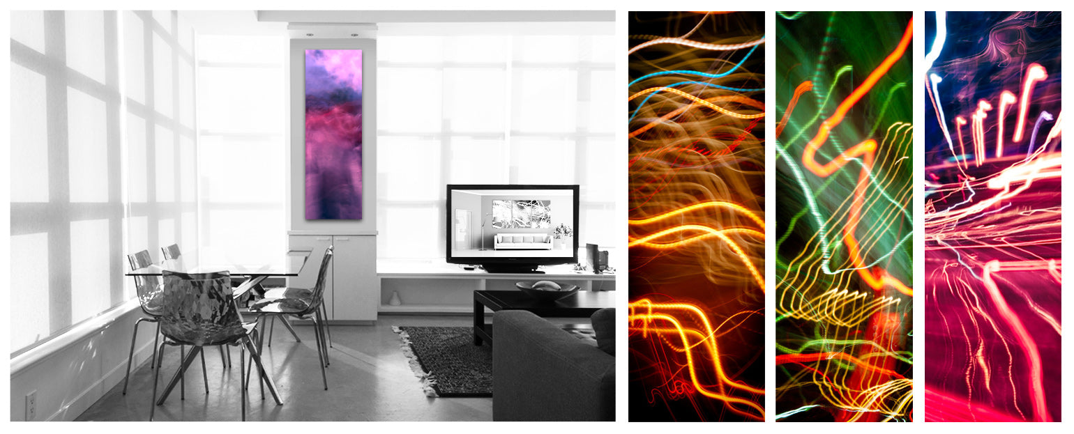
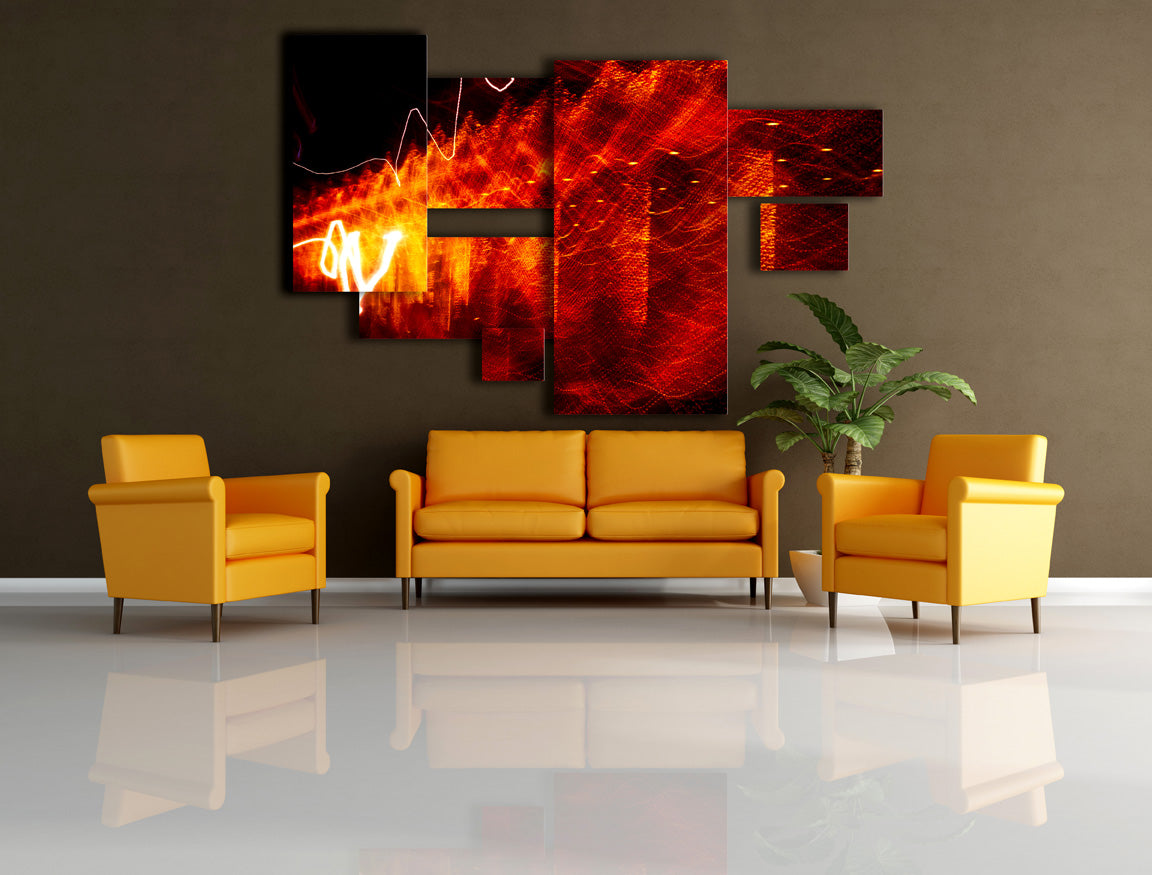
One Prints or Multiples
Let’s say you want a large unframed print to cover whole wall. How do you carry it into your house? It will not go through your door.
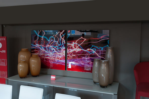
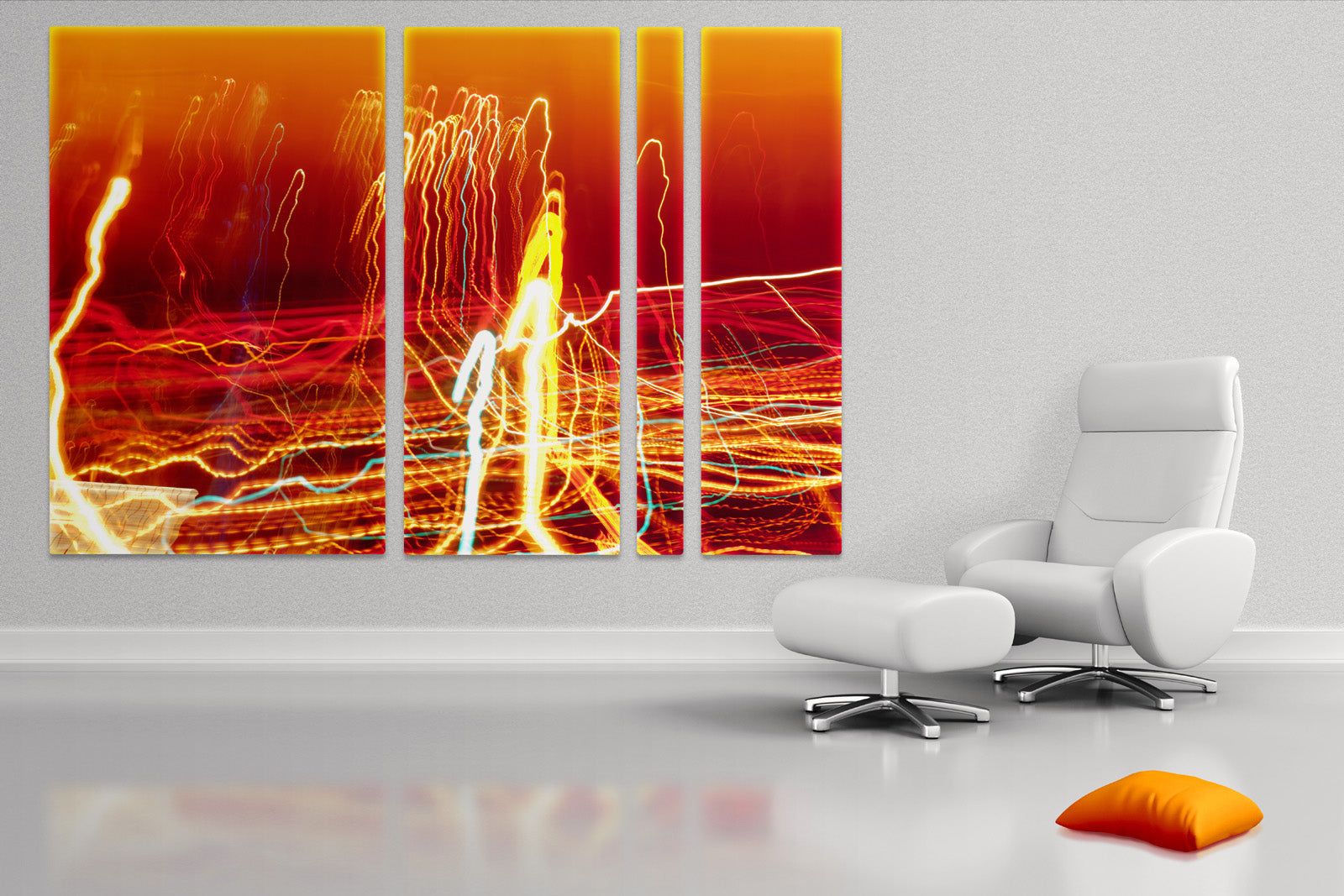
You also can save up to 30% of budget going with split prints. It’s fun and unusual. It’s noticeable fro sure and you’ll get complements. Each piece can work as a stand alone print and you can decorate more than one wall or even rooms! Think about it…
There is also technical restriction coming from how aluminum boards produced. Prints can not exceed 40x90” dimensions. So if your design requires larger prints splits can save the day. Again, having all this freedom assumes that prints are frameless and light. That’s what print on aluminum are :)
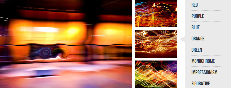
Color and Composition
There are couple general rules you may want to follow.
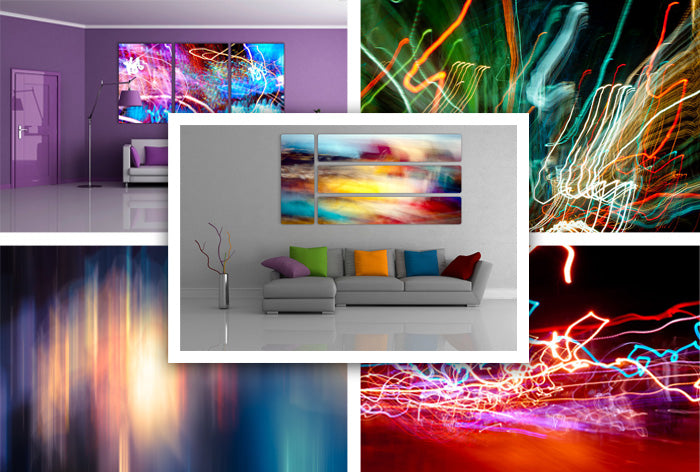
Interior with beige walls can be complimented with brown, light pink or purple and blue or red prints.
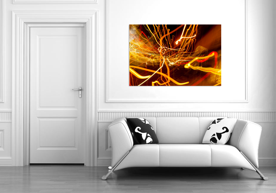
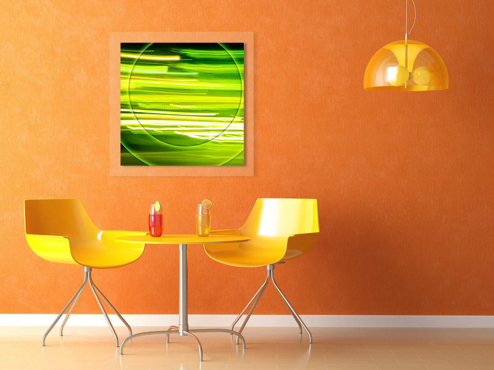
Dark rooms are good with prints with saturated colors. Green and blue goes wall with brown, red plays well with purple walls, bright green is awesome on orange, grey and white walls will accept print with any color.
Please remember that you need to connect with color and print energy. Energetic red prints are usually good for living and dining rooms but maybe not be safe for bedroom. Abstract prints are full of inspiration. They are good for offices and public places.
I noticed that interiors with traditional designs are better with impressionistic style framed prints. On the other hand modern style apartments with exposed concrete and brick walls, with lots of glass and aluminum or chrome are good match for abstract night light prints with almost any color keys.
About this Design
It’s a square print with brown and cold purple tones to complement beige and brown colors of interior but work as a center piece.
White border helps print to stand out and isolates it from the wall.
Copper color of the wooden frame complements fireplace glass frame and metal elements of the lamps. It plays well with floor tiles too.
About this Photo

It’s a night shot of King St in Toronto closer to midnight. You can see that I was standing in the middle if the road facing east. My wife was watching cars on other side. There are light from restaurants on right and TIFF Bell Lightbox lights on the left.
What is your experience with decorating interior with prints?