
I thought it looks cool to take entire column on Pinterest with one large abstraction! I am not doing nothing new here and saw it before but still I think this is pretty cool :). Here are more: http://pinterest.com/arebrov/vertical-prints/
All these crops are made from images of my Abstract Light collection.

With progress in print industry, metal work and engineering interior designers and artists can use wide spectrum of materials and forms working on interior design projects. Large wall art becomes increasingly complex and draw more attention. Today walls with designs are focal points of lofts and large apartments. Wall design has that 3d feel and works with whole room and furniture. Wall texture and color play important role too. I personally like grey, purple or red walls with exposed concrete or plaster. They work well with my pink and blue designs or with multi-color pieces. I prefer large size art. If I stand in front of large piece I feel like my entire body speaks with colors and shapes. Pink and red energizes me and opens up my creativity. Combination of pink and blue is very inspiring. It feels like watching a distant ocean sunset on windy southern sky....

Room decoration with art prints is an interesting exercise! You can approach color selection from complimentary side or play along with established accent color. But how to deal with difference in light? Let’s set a design experiment: medium size room with normal 9 feet high ceiling. There is a bed in the middle and a large window looking out South-West. There is an empty wall between two doors. I want to put my art prints there :) Despite light color of the wall paint rear wall looks dark in afternoon or even most of the day if windows have shades or covered with drapes. Light and small art will be lost out there. Here is an example of a dark and high contrast print with very bright expressive light strokes. Red and orange continue general wall color hue and violet and pink work as a color accent. These prints can...

In February all holidays were over and winter got stronger. It impacted sales first but by the end of the month rhythm of visits increased and sales picked up.
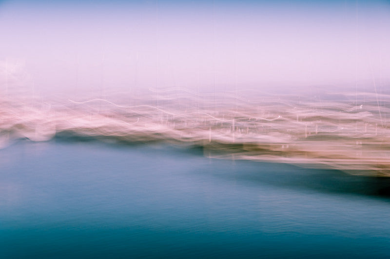
Here is a Best Of February collectoin of most popular prints in views and sales. I personalty very glad to see my favorite Pink and Blue among leaders but hey, I like them all :) What's your favorite?

Last week I installed abstract print on aluminum into my client's apartment. It was fast and easy using aluminum push-pins. The print became a focus center piece on a wall and brought light and lot's of energy. Client is happy and so am I :)
You can check out how this print was delivered and built.
So, I like cold colors. And I like wind... Maybe because I am a Capricorn. That subconscious magnetism of solitude and deserted places attracts me to rough weather and open horizons. I also like dark and smoky places but this post about clear sky and cold transparent air and about hope that next thing you'll experience will change your life forever.
What is your color?

