How to choose right size of the art for your room. Part 1


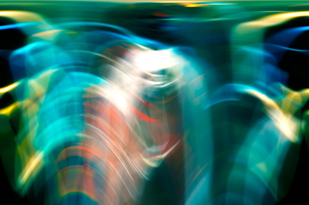
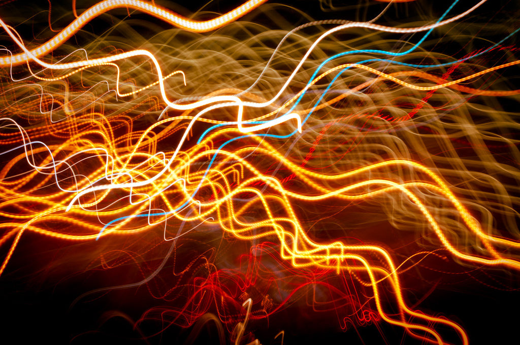
Choosing artwork for interior can be difficult. In this post I assume that you're fan of abstract art, artwork will hang on a wall and you're dealing with art within $10,000 budget. Why is budget important? It usually means that the art you considering belongs to family of decorative accessories. Let’s assume that the piece of art does not require special treatment, lighting, and security and so on as it would if its price is substantially higher and the name of the artist is well known among collectors and art investors.
There are some questions you may want to consider choosing art for your interior décor project:
- Art format?
- Will it be a decorative accent or a center piece?
- Is your design permanent or temporary?
- Do you need help installing art?
There are several other questions like lighting and overall color scheme of the space but these are out of the scope of this post.
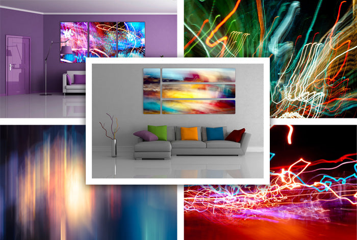
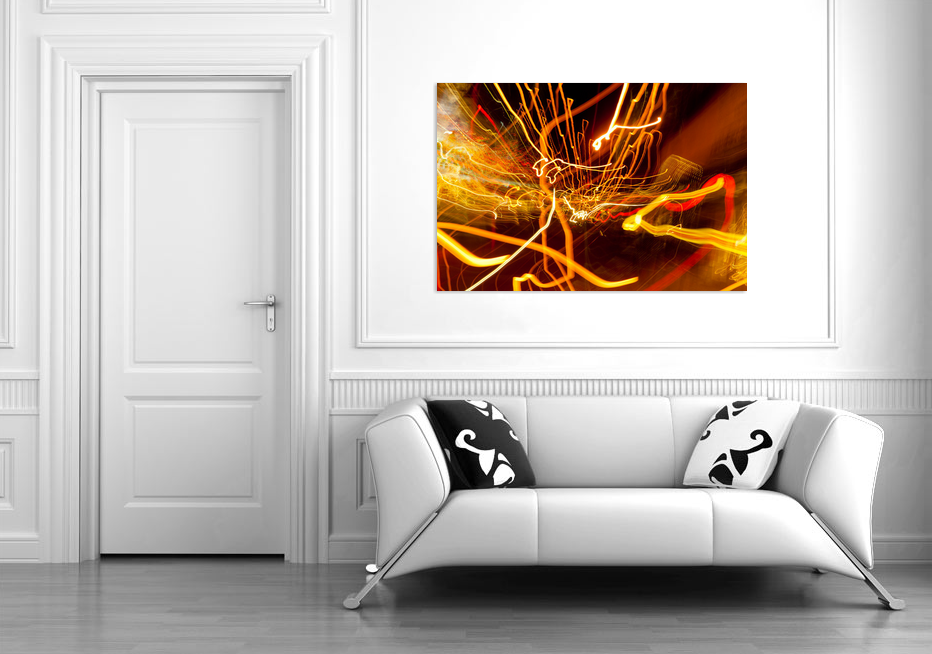
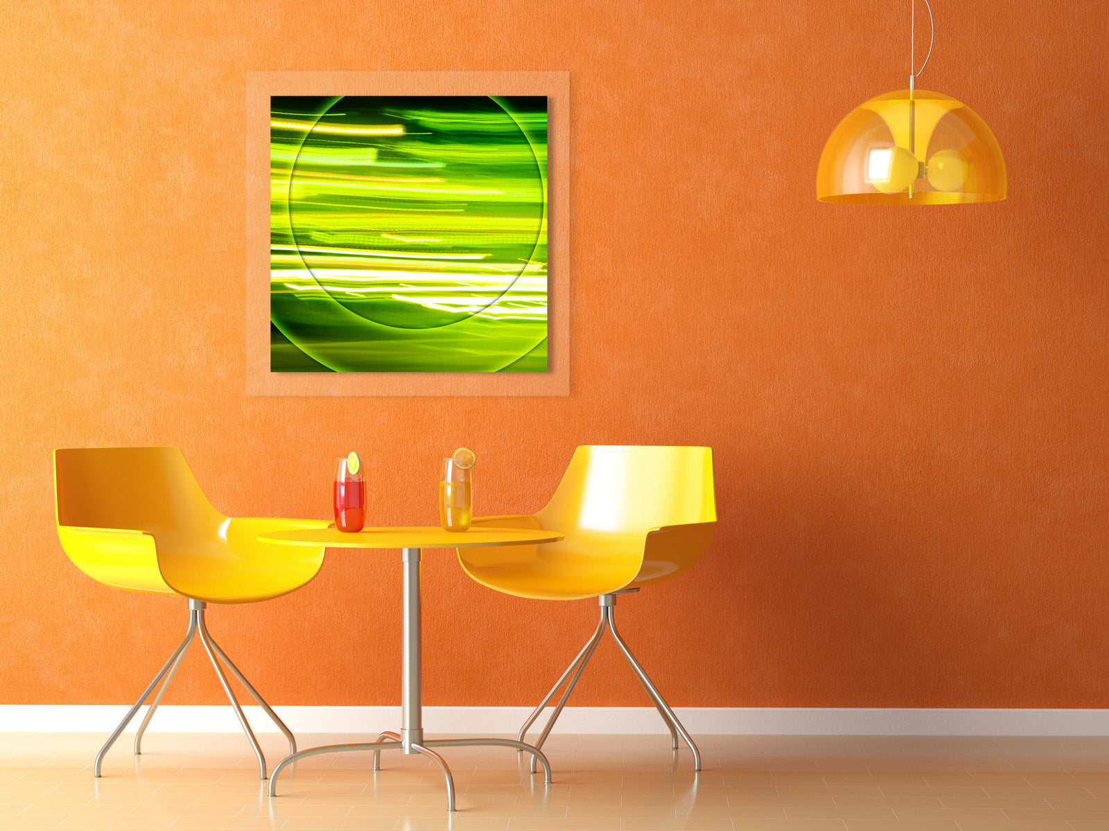
Select right format of the art (square, panorama, traditional)
It’s important to know how art will be looked at. Will people be standing or sitting as they look at the artwork?
Gallery and museum standard is to hand art so its vertical center aligns with eyes level of standing man or woman. Interesting fact that average height of man is different from woman and varies from nation to nation! Wikipedia article about human height.
Let’s assume that your décor project takes place in US where average people’s height is 5 ft 7 in or 170 cm. Eyes level is about 5 in lower than the human’s height. It leaves us with 5’2” or 157 cm vertical center of the artwork for places where people stand or walk. If people sit on couches and sofas their eye’s level is 41” or 104 cm. If people sit by the table their eye’s level is 45” or 114 cm.
This is only important if the place you are decorating have lots of public traffic. Otherwise just measure your height and height of members of your family who will see the art.
First, assess the wall and light. If the wall is in front of bright window assume that you may have a problem with high gloss art or art framed behind the glass. Also over-lit artwork tends to look larger and depending on technology colors may look washed out. Contrary, prints on aluminum look good in well lit spaces. Their vibrant colors colors look deeper. But direct light affects print dies and in some time they become less bright.
If the light comes from the side think about how strong the source is and will it be enough to lit further edge of the artwork. You don’t want large expensive panorama hide one side in a dark shade.
Of course equally dispersed non-direct light is the best and let you choose the art that fit the wall and visible all day.
Take a look at the wall. There are two geometries to consider: geometry of the wall as it connects floor, ceiling and other walls and geometry of visible wall which is always less after you consider furniture and fixtures (also windows, switches, shades, curtains and other artwork.)
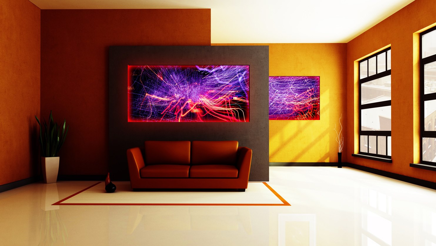
On slide #1 you can see wall of a room with 9 ft ceiling, 25 in high sofa, small fixture and average person. Let’s draw an imaginable line indicating person’s eye. It will be on 5 ft 2 in or 158 cm level. You will want to stay close to this line for almost all cases except couple of examples I describe later.
Slide #2: If the fixture does not hang too low space above sofa forms a virtual square and proportions of artwork may repeat the wall geometry. Art placeholder in this example is 52x52". If the 1.5 or 2 in under-frame holds the art you will get nicely finished and bold look. Aligning the center of the art with eye’s level let beholder enjoy artwork as the whole composition grasping top and bottom edges at the glance. Conveniently positioned this art will invite exploration and people can look at it for a long time even without moving their head. This is especially important if the artwork composition employs lots of color shades and small details. You will appreciate this position of the art even more when someone will sit on a sofa and they will not interfere with artwork, Slide #3.
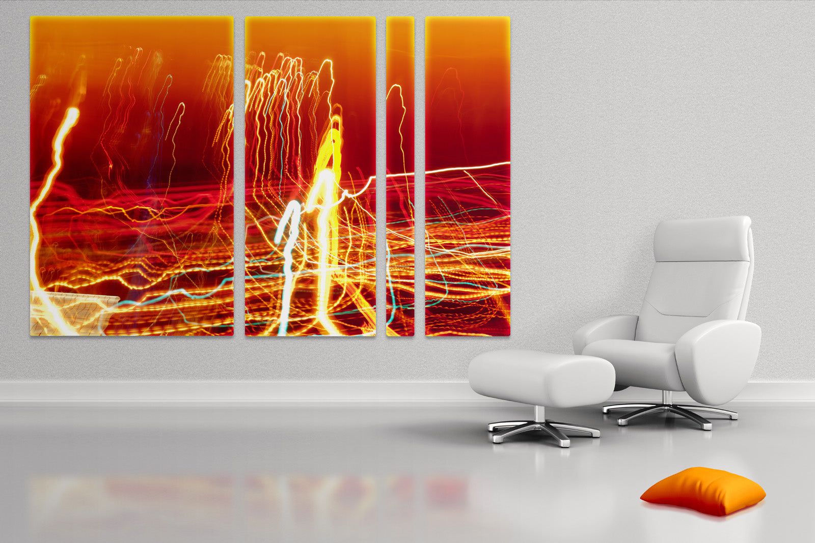
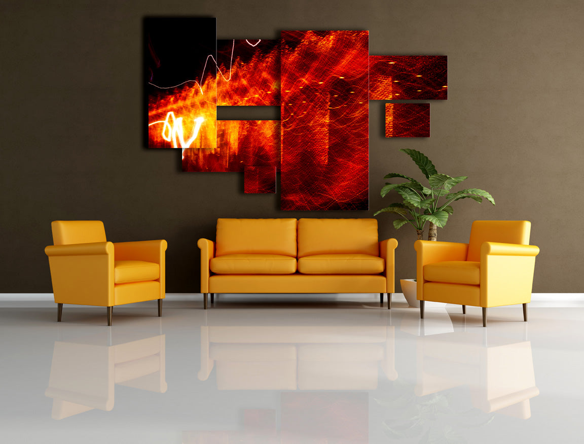
Please remember that we talking about artwork placeholder. In reality it’s impossible to make one print on paper or aluminum larger than 46” smaller side and 90” larger side. Take a look at slide #4. Same placeholder is taken by 4 24x24” squares. Composition is much more intriguing and may have deeper visual impact. This design is much easier to ship and handle. Cons of this deign is that you need to properly align all 4 pieces (or pay professional to do it for you. $40 will cover the cost including unpacking the art.) Because there is more framing material and labor involved in making designs they usually cost more. The only exceptions are frameless designs with smaller pieces. They come with mounting block attached to them and usually require just one screw per piece. In cases with larger designs be prepared to make 8 holes in your wall. Believe my experience; it’s better than just 4 because with 2 screws per piece you can move them horizontally when you need to align them. One screw per piece does not let art to be moved, you will need to make another hole.
Now let’ assume that there is no fixture in close proximity to the art, slide #5. You may explore variants hanging art in the middle of the wall taking advantage of space above the art. It may work for large spaces of a hotel lobby or a large bright foyer where people don’t come close to the artwork but rather enjoy it from a large distance. In this case art in the middle of the wall will add balance to the wall. But remember that large distance from beholder is a key for this positioning.
So far we considered square shape of the art. It naturally repeats the geometry of the available wall in our example and looks balanced in that space. Another interesting benefit is that you can rotate art either direction if artist doesn't mind and composition allows this kind of improvisation. As a side note, I remember working on my earlier abstract graphical sketches and rotating them up side down to get a new fresh prospective on composition. Rotation is hard to do if your art is not a square or a portrait or other representative art. But with contemporary non-representative abstractions without visible artist signature on a face or the art one can rotate artwork every week. Of course how art mounted to the wall is very important. My large scale art usually attached to the wall by two screws which hold under-frame by the back lip. Rotating art in this case is 10 seconds project :).
In part 2 we will explain cases for traditional format art and panoramic placeholders. Also I will show examples of improvisation with triptych and diptych. I will explain difference between accent and feature artwork. I will also let you play and imagine what you may do when you get tired from very traditional art installations.