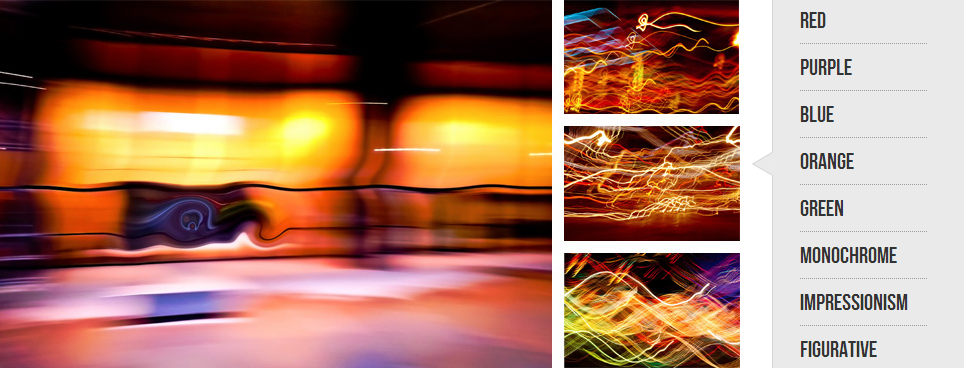
I work with many interior designers and they often ask me to find an abstraction "...lots of orange... " because decor needs an accent element and its color sometimes is very predetermined. It’s a common knowledge that red, orange and yellow are energetic colors. Spaces with these colors make people act and think faster. They encourage conversation and open exchange. These colors are good for dining or family room. It will work great for public office and working space. Green and blue are considered soothing colors and good for quiet rooms and libraries. It may work as well for your bedroom. I personally prefer darker art for my bedroom and I think that this monochrome art collection encourages fantasy and contemplation. What color would you choose for your bedroom and living room? I had color collections on my site from very beginning on this page you can preview color collection...

I am glad to present new type of wall designs made possible by new technology in cutting and extrusion of aluminum materials. This design made from one solid aluminum board cut into 3 pieces and attached to specially designed under-frame. This type of art was not done before and I am very proud to get it available for my clients. What's unique about this design is that it becomes metal sculpture and attracts attention not just by colorful abstract print but also by it unusual shape. It transforms space around itself and becomes something bigger. Lines of metal shapes now work together with content of abstraction. When you purchase this design it will come in two wooden crates which fully protect aluminum during transportation. Crates are art on their own and my customers always admit the quality of packaging. Wow, what else can I say?! I'm very excited. To make...

Purple and orange as very late sunset sky when you just forgot that you waited whole day for it. You run outside and look out for the sun but it's already too late and all you see are purple sky and pink and orange clouds far west. First orange becomes red, then pink becomes blue, then all become black... Stars will come later at night. You turn back and make new pot of coffee. Maybe you will get out one more time to look at stars but maybe not today.

I love working in small sprints. Inspiration comes from very unusual and unexpected thinks and activities. This time I watched sci-fi movie and this palette was hunting me for a week :). As a result I created a series of four pieces with vibrant orange accent color on top of mix of my favorite pink and purple.
They can be combined into triptych or live separably in different rooms. There are many options to play with including framing and matting.
If you in the middle of the decoration project and wonder about colors associated with these pieces here is a palette from ColorLovers to help you out.

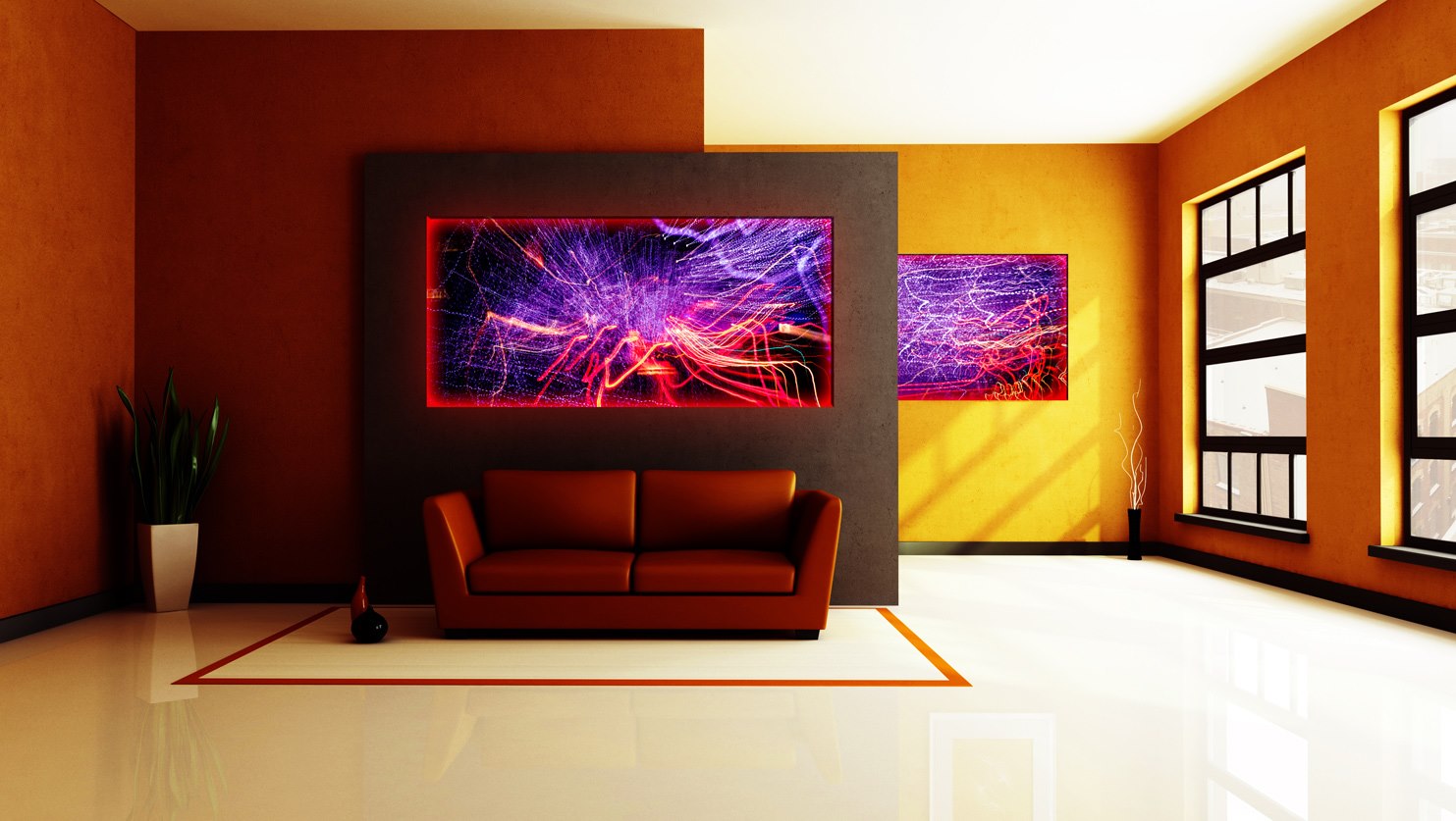
Room decoration with art prints is an interesting exercise! You can approach color selection from complimentary side or play along with established accent color. But how to deal with difference in light? Let’s set a design experiment: medium size room with normal 9 feet high ceiling. There is a bed in the middle and a large window looking out South-West. There is an empty wall between two doors. I want to put my art prints there :) Despite light color of the wall paint rear wall looks dark in afternoon or even most of the day if windows have shades or covered with drapes. Light and small art will be lost out there. Here is an example of a dark and high contrast print with very bright expressive light strokes. Red and orange continue general wall color hue and violet and pink work as a color accent. These prints can...
The simple answer is YES. And here is why. As an example I chose this large yellow room with brown accent wall and light ceiling and reflective floor. I can assume that the walls pained with BM Lemon Shine 2020-20. Further from the windows the walls don’t look that bright and are more brown. Soft furniture can be navy or red. Even dark green will work. It depends how you feel about matching colors and textures. Illuminated aluminum prints can have its own color of light and can be deemed to the your liking. It means that in the dark area of the room illumination plays a role of additional lighting. You can’t read a magazine but you can linger with iPad for sure :) Deep saturated color of the walls allow bright abstract aluminum prints and dark paintings. This room with prints feels quiet and warm when it’s bright...

