
Psychological research into a variety of colors has found some interesting and, in many cases, useful effects of looking at different colors and in some cases being surrounded by them. You may already know that blues and greens are calming, relaxing colors while more bright, aggressive colors are able to provide the opposite sensation. Yellow is said to boost the memory but also makes the viewer think more, while red has been said to cause some stimulation of both body and mind. Red can actually warm the body and increase the heart rate as well, but it may also cause higher blood pressure. As a result, if you are suffering from any illnesses that may be aggravated or worsened by those side effects, you may need to steer clear of red in your interior designs. One great way to use red, though, is in an exercise room or any other...
I work with many interior designers and they often ask me to find an abstraction "...lots of orange... " because decor needs an accent element and its color sometimes is very predetermined. It’s a common knowledge that red, orange and yellow are energetic colors. Spaces with these colors make people act and think faster. They encourage conversation and open exchange. These colors are good for dining or family room. It will work great for public office and working space. Green and blue are considered soothing colors and good for quiet rooms and libraries. It may work as well for your bedroom. I personally prefer darker art for my bedroom and I think that this monochrome art collection encourages fantasy and contemplation. What color would you choose for your bedroom and living room? I had color collections on my site from very beginning on this page you can preview color collection...

Animated slideshow with wall designs featuring abstract prints on aluminum. Initial clip illustrates glossy reflective surface of prints on aluminum. The size of the print in this video is about 80x40" split into 3 equal pieces.

As any artist working with defined medium I have a legacy of works which establish my style. It makes my work recognizable but also it limits my creativity when I want to step outside and widen up my style. Yesterday I worked on this piece and decided to add my "hand touch". The final work has a different feel than my other pieces. The blues are very light and gradually turning into turquoise like ocean water. The bottom right part has that psychedelic blur when you don't know if a picture doubled or whether you loosing grasp of reality. This piece needs to be looked at in large size and will be great on light or white wall. The more light exposure it gets the better the effect it produces. Greens and blues are commonly considered calming colors but it really depends on your connection with this picture and the...

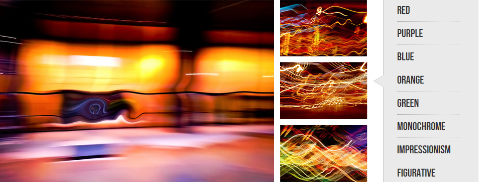
Room decoration with art prints is an interesting exercise! You can approach color selection from complimentary side or play along with established accent color. But how to deal with difference in light? Let’s set a design experiment: medium size room with normal 9 feet high ceiling. There is a bed in the middle and a large window looking out South-West. There is an empty wall between two doors. I want to put my art prints there :) Despite light color of the wall paint rear wall looks dark in afternoon or even most of the day if windows have shades or covered with drapes. Light and small art will be lost out there. Here is an example of a dark and high contrast print with very bright expressive light strokes. Red and orange continue general wall color hue and violet and pink work as a color accent. These prints can...

Here is an example of metal prints took to yet another level. What if you want to cover entire wall with print?
With prints on aluminum you easy can do it and you don't need to break the bank for that.
Prints on aluminum are light and thin. You simply can glue them to your closet doors!
Whould you consider this idea for your next project?
About the photo
It's a long exposure photo of downtown Toronto in March 2012 with some design elements.

Design influences our thinking and how we feel. People always have opinion about design. Some of you may have opinion about red color, some like bright rooms, some like dark and quiet interior. Entire branding of Apple is built on simple assumption that people want to interact with nice well design devices. Why not invest in interior design? It will align your feelings, make you either relaxed or organized. It doesn't need to be expensive. I promote investing in interior decor with art. There are two things you need to remember: 1) color your walls having plan about wall decorations you want to hang later. 2) don’t buy cheap stuff. Simple as that. Here is an example of decor with 2 sets of prints on glass. One concrete wall is not painted at all and another has a layer of primer. Prints on glass, especially tempered glass are ultimately indestructible....


