I have been listening to ambient music as long as I can remember. It always was a source of my inspiration and my first help to get concentrated and focused. Although ambient sounds and entire music direction emerged as music or relaxation I can’t say that it relaxes me at all. It’s quite opposite. When I hear obscured, distorted sounds and fragments of songs or human speech my mind races against time trying to decode the pattern and build a recognizable image or story. That’s how our mind works. It can’t help but recognize patterns and put finished images and objects within even larger story which evolves in time and makes sense. Welcome to science of dreams! My art has a similar nature but admittedly different direction. Something was moving first. It was part of a large whole. I took a slice of it and disconnected from the world. Those...

With progress in print industry, metal work and engineering interior designers and artists can use wide spectrum of materials and forms working on interior design projects. Large wall art becomes increasingly complex and draw more attention. Today walls with designs are focal points of lofts and large apartments. Wall design has that 3d feel and works with whole room and furniture. Wall texture and color play important role too. I personally like grey, purple or red walls with exposed concrete or plaster. They work well with my pink and blue designs or with multi-color pieces. I prefer large size art. If I stand in front of large piece I feel like my entire body speaks with colors and shapes. Pink and red energizes me and opens up my creativity. Combination of pink and blue is very inspiring. It feels like watching a distant ocean sunset on windy southern sky....

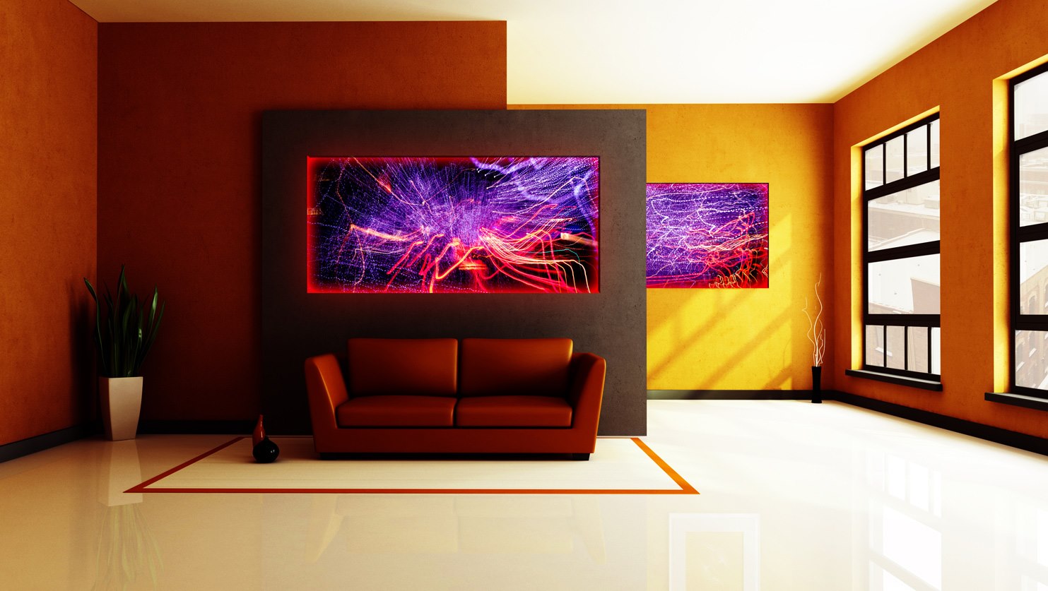
Music inspired new orange, red and yellow piece with accent blue line. I was listening to “Zeichen meines Lebens” by Klaus Schulze from “Historic Edition”. Cosmic and time traveling thoughts come to mind. Dark edges and bright center on top of dreamy brown and red background.

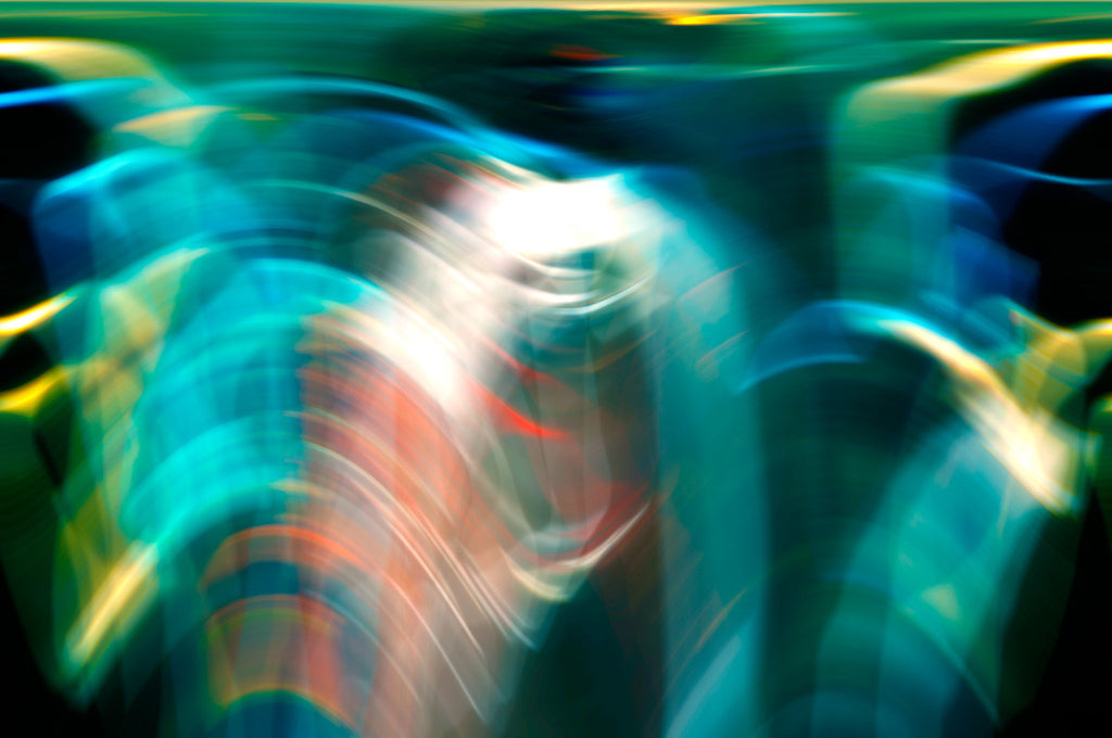
Blue and green, turquoise and coral are the color of this abstraction. It reminds blurred sun rays fading out in shallow waters of Mediterranean Sea. It seams that you going to recognize something in that mix of shadow and light but you can’t concentrate on one spot. High contrast abstract with vivid bright color will look equally good in bright room or in low light home.
There is nothing worse in modern interior design than a room that just doesn't do anything. Perhaps it’s a white, cream or gray color with minimal wall art, which leaves the room feeling bland and boring. Perhaps you have envisioned this room with some color, but been unable to come up with the perfect way to do so. One great option to add a great deal of bright color to a room that is lacking it is to use abstract art on the wall as a creative, colorful center piece. One great thing about this method is that the less exciting the rest of the room we have to cover is, the more the abstract art will stand out. On a white background, a piece of bright abstract art may really grab the attention. Colors seem filling out entire room adding vibrant energy and light. There are certainly a variety of ways...

I love working in small sprints. Inspiration comes from very unusual and unexpected thinks and activities. This time I watched sci-fi movie and this palette was hunting me for a week :). As a result I created a series of four pieces with vibrant orange accent color on top of mix of my favorite pink and purple.
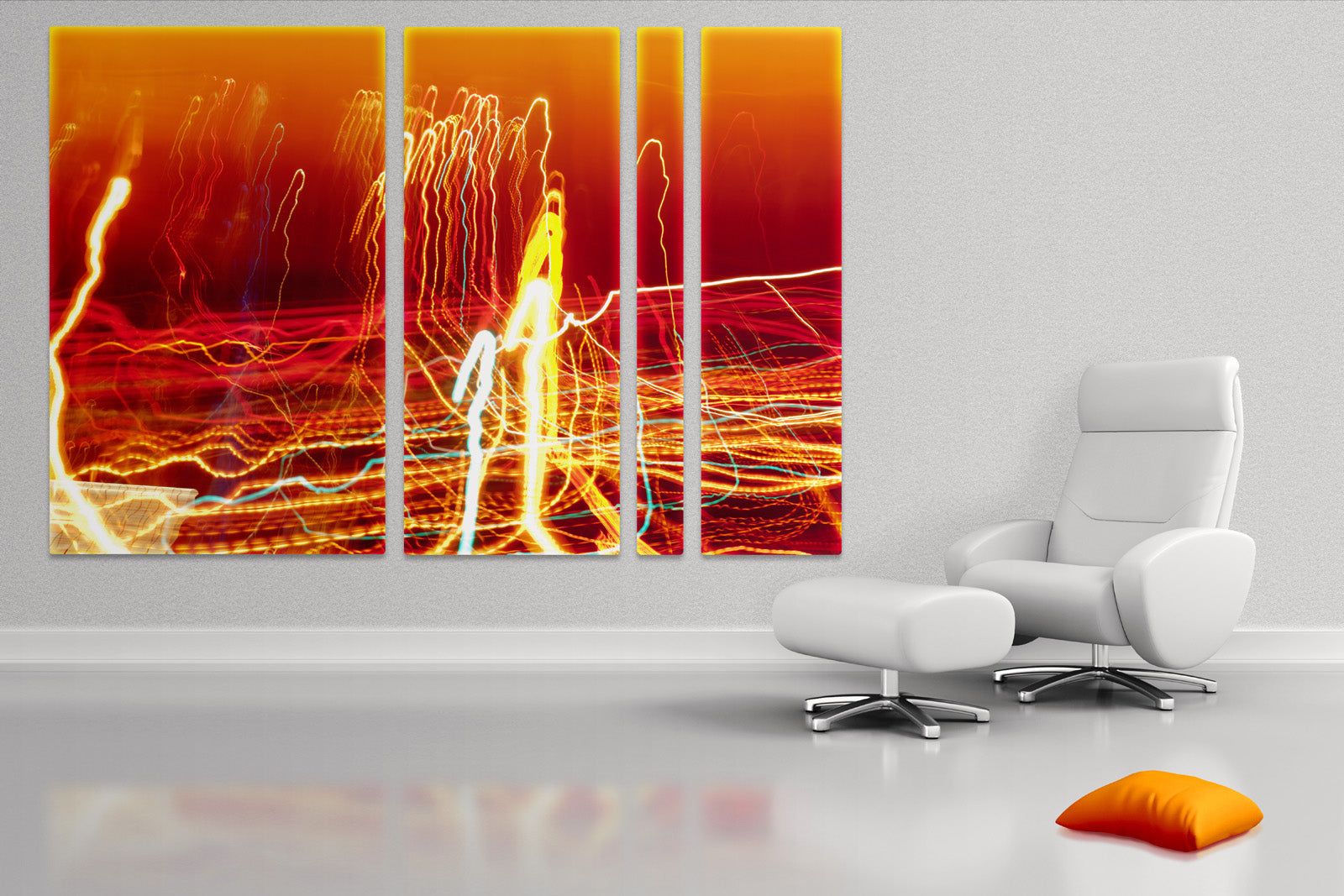
They can be combined into triptych or live separably in different rooms. There are many options to play with including framing and matting.
If you in the middle of the decoration project and wonder about colors associated with these pieces here is a palette from ColorLovers to help you out.
It's always true that one image worth a thousand words. I added new most anticipated feature which allows customers to preview a photo in a room. Just click ROOM button above the product. You can change Size dropdown to preview print in corresponding dimensions. The system will remember your preferences for Size and Medium when you navigate to a new product and will set the page for you. You also may enlarge the the preview by clicking on LARGE button. The system will display large product or room image and will push the shopping cart further below. If you'd like to reset all views to initial simply click IMAGE and SMALL buttons. Did you know that you can navigate the collections using Left and Right keys of your keyboard to quickly jump to next or previous product? What other features would you like to see? I would love to hear...

What will happen if you take modern materials and latest print technology and combine them in decor project (or prototype in this case)? I asked myself this question looking at photo of yellow couch and plastic reflective shelves. Here is what I come up with. Modern technology allows printing on any flat surface. It can be wooden board, aluminum plate, cardboard (why would I print on it?..) and glass. I already have experience with prints on aluminum and my customers are familiar with their scratch and finger prints resistance. Colors look great. They are thin and light. But what if I don’t need thin surface? I want something different… How about glass? I kept thinking about glass whole weekend and did research about printing on glass. No problem. Can be done! I can print on glass and mount it on foam core or painted wooden box depending on distance from...
The simple answer is YES. And here is why. As an example I chose this large yellow room with brown accent wall and light ceiling and reflective floor. I can assume that the walls pained with BM Lemon Shine 2020-20. Further from the windows the walls don’t look that bright and are more brown. Soft furniture can be navy or red. Even dark green will work. It depends how you feel about matching colors and textures. Illuminated aluminum prints can have its own color of light and can be deemed to the your liking. It means that in the dark area of the room illumination plays a role of additional lighting. You can’t read a magazine but you can linger with iPad for sure :) Deep saturated color of the walls allow bright abstract aluminum prints and dark paintings. This room with prints feels quiet and warm when it’s bright...

