
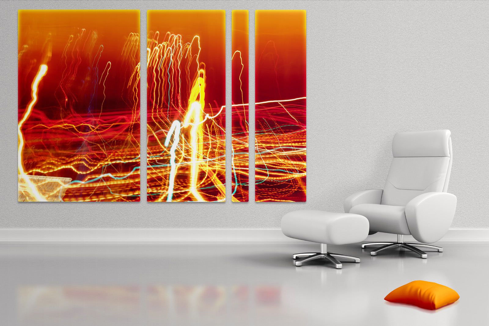
July 25th is an opening night of my show at Akasha Art Projects. I am presenting framed prints on aluminum and large format aluminum triptychs and designs. It's a perfect chance to look at vivid colors of aluminum prints in an old house with contemporary white decor. I will be there to welcome you and answer all your questions. I invite all my friends and people supporting local artists and photographers. Let's talk about industry, art and colors. Hope to see you there!
Date: July 25, 2013, Time: 7 - 9PM Place: 511 Church Street, Toronto, ON, Canada
Show will be open until August 31, 2013

Animated slideshow with wall designs featuring abstract prints on aluminum. Initial clip illustrates glossy reflective surface of prints on aluminum. The size of the print in this video is about 80x40" split into 3 equal pieces.

As any artist working with defined medium I have a legacy of works which establish my style. It makes my work recognizable but also it limits my creativity when I want to step outside and widen up my style. Yesterday I worked on this piece and decided to add my "hand touch". The final work has a different feel than my other pieces. The blues are very light and gradually turning into turquoise like ocean water. The bottom right part has that psychedelic blur when you don't know if a picture doubled or whether you loosing grasp of reality. This piece needs to be looked at in large size and will be great on light or white wall. The more light exposure it gets the better the effect it produces. Greens and blues are commonly considered calming colors but it really depends on your connection with this picture and the...
There is nothing worse in modern interior design than a room that just doesn't do anything. Perhaps it’s a white, cream or gray color with minimal wall art, which leaves the room feeling bland and boring. Perhaps you have envisioned this room with some color, but been unable to come up with the perfect way to do so. One great option to add a great deal of bright color to a room that is lacking it is to use abstract art on the wall as a creative, colorful center piece. One great thing about this method is that the less exciting the rest of the room we have to cover is, the more the abstract art will stand out. On a white background, a piece of bright abstract art may really grab the attention. Colors seem filling out entire room adding vibrant energy and light. There are certainly a variety of ways...

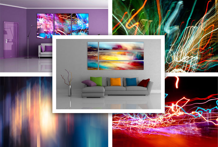
If you turn the pages of any magazine that features pictures with backdrops set in modern interior design, you are likely to see some abstract art in one form or another. The fact of the matter is that abstract art can be used in so many different ways that it is becoming increasingly popular among interior designers. Also, in day when canvases are being used to create a shape of their own for the prints, abstract art can really add life to an entire room. Take, for example, this look at the use of abstract art and the modern design invoking shapes and geometry. It combines with the purple furniture and wall to help to set the mood for the entire room, while also giving the room a focal point. While the purples might be calming in and of themselves, when coupled with the stormy abstract art, the entire scene...
As weather was getting warmer every day I was getting more sales of impressionistic pieces with soft colors and smooth shades. Especially popular was 4 piece design with bright yellow and red colors. It looked like my customers wanted to warm up their homes faster and get into summer mood even faster. I need to admit that winter is longer this year and it makes everything around even look dull and old. Naturally we all trying to get energy from all sources close to our reach. Bright and vibrant colors give us just that.
I was happy to see that new line of diptychs was accepted very well and they contributed to this collection of bestsellers. Purple and red colors proved again to be very popular among my fans.
I want to thank you all for purchasing my art and I am looking forward to see you back in summer!

If you are a fan of Google Plus as I am you know that it provides amazing photo viewing experience and ways to communicate with artists. I recently created a page for Alexei Rebrov Art and invite you to join a conversation and share my art with your circles.

I have a collection of diptychs inspired by success of my panoramic print. Of course ideal setting for the piece of art is isolated wall in the middle of the room where beholder can step back, sit down and enjoy the abstraction. Dive into underworld of fantasies and dreams. Usually museum settings works fine for that. But no one wants to live in a museum. We all live in space surrounding ourselves with stylish furniture and lighting. Art plays decorative role in modern interior design and panoramic prints are perfect fit for over the fireplace or behind the couch wall. If you know the exact size of the wall then one piece print will work just fine. But what if you want to experiment with space and light. Diptych design gives you this privilege. You can put two pieces next to each other with no space in between or you...
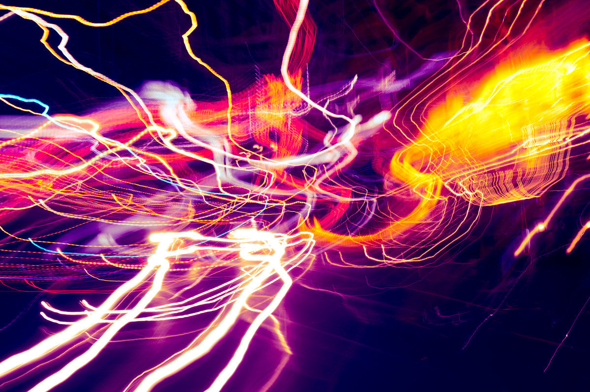
I love working in small sprints. Inspiration comes from very unusual and unexpected thinks and activities. This time I watched sci-fi movie and this palette was hunting me for a week :). As a result I created a series of four pieces with vibrant orange accent color on top of mix of my favorite pink and purple.
They can be combined into triptych or live separably in different rooms. There are many options to play with including framing and matting.
If you in the middle of the decoration project and wonder about colors associated with these pieces here is a palette from ColorLovers to help you out.

In this post I compare two prints I made from the same capture. I explain main differences that you need to know before deciding to purchase aluminum print or print on metallic paper. At A Glance Feature\Medium Print on AluminumMetallic Paper Durability 3 2 Reflection 2 2 Weight 3 2 Large Size 3 1 Price 2 3 Score Total: 13 of 15 10 of 15 Here is a photo of aluminum print and print on metallic paper side by side. Both prints have very high quality of colors and contrast. Aluminum print on the left has a perfect smooth surface and it’s more reflective. As you can see on a photo its surface reflects the windows from across the street building like a mirror. There is not even slight blur. Reflection is sharp and you can recognize the building even further behind the first one. Print on...
